13 rules of online payment page design
One of the primary factors affecting how many users complete a purchase on your e-commerce site is the design of your payment page.
A checkout process has to be intuitive, effortless and user-friendly. In addition, unlike a point-of-sale (POS) transaction, where the customer is physically present, online payments pose the added challenge of potential fraud.
In this article, we will walk you through the steps to create a secure payment page that enhances the user experience and boosts your conversion rate.
Why is a well-designed online payment page so important?
Almost 70% of online shopping carts are abandoned, an alarming statistic for e-commerce websites. One of the top reasons cited for cart abandonment is a complicated checkout process, with concerns about payment security also being a major factor.
Additionally, the average conversion rate is 58%, leaving plenty of room for improvement and demonstrating the importance of getting the design of a payment page right.
The overall design of a payment page should resemble your e-commerce platform or website. This will enhance the customer’s in the payment process and help build brand loyalty.
However, some payment gateways offer limited customisation options when designing a payment page. Here, we share our tips on increasing the conversion rate of the payment page while providing you with examples of our own solution to show you how easy it is to create a bespoke payment page in less than an hour.
Key factors to consider when designing your payment page
1. Fonts and fields
Maintaining a consistent brand look and feel is important. Your corporate fonts should be used throughout, from the customer’s first interaction with your brand to the payment confirmation page.
The font and size settings selected must be legible even on smaller devices to ensure the customer can easily enter and review their information in each field. Otherwise, the customer might abandon the process if the payment was declined due to entering their details incorrectly but being unable to identify their mistake quickly. Remember that typos made by the customer might not necessarily be highlighted as being incorrect if they have put the information in the correct fields.
2. Form background and field colours
As a customer moves through the purchase process, when the payment details page appears, it’s advisable to change the background, such as by blurring the previous page they visited, to signal to them they are about to complete the transaction without making them feel like they have left your website altogether.
If you prefer a custom background, avoid using colours that could reduce the visibility of key elements on the form. Ensure text readability on the selected background colour and keep the palette consistent with your brand to create familiarity.
For optimal UX, we also recommend not changing the field colours, as this could make information less clear and lead to input mistakes. Field colours should only be used to highlight where a customer has made an error which prevents them from completing the checkout.
3. Background images
Another vital element of the payment page is the image used in the background. The best way to explain the dos and don’ts when selecting a background image is to show some visual examples.
Background images not to use
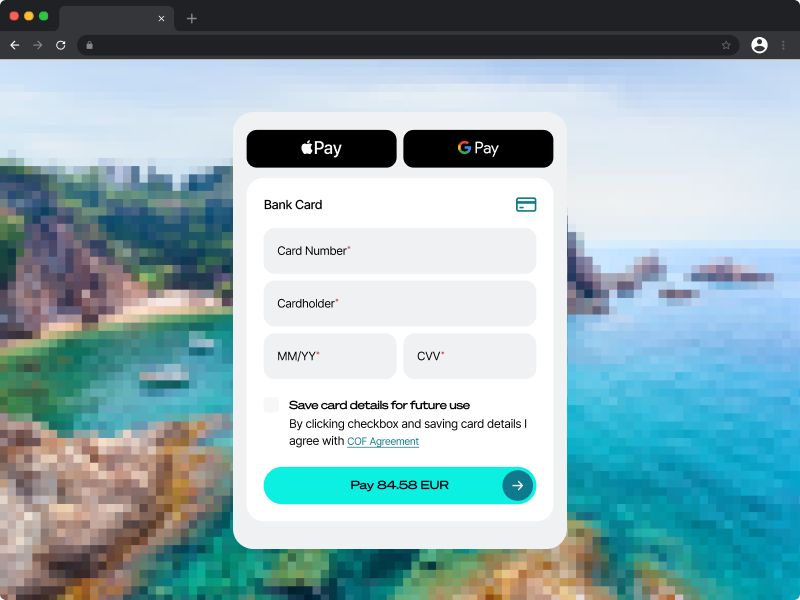
Low-quality images
Low-quality, pixelated images do not look visually appealing and may raise concerns about the trustworthiness of the payment page.
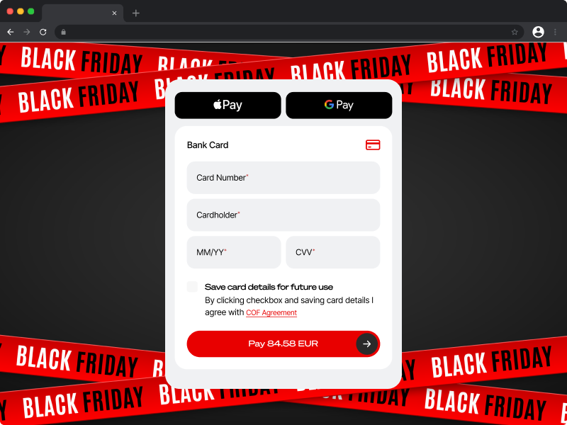
Distracting images
The image contains distracting elements such as information about the company, motivating slogans to complete the purchase, and others. These can distract customers from entering the payment details.
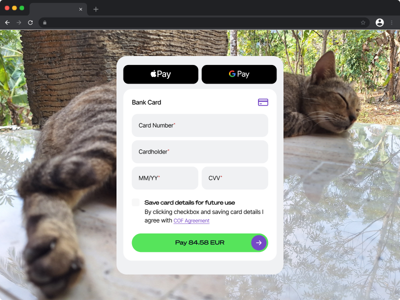
Irrelevant images
When the image is unrelated to your company or to the product you provide, it confuses the customer, which may cause a drop in the conversion rates.
Recommended background images
A plain white background
If you want to keep the checkout as clean as possible, a simple white background can be effective and keep customers focused on completing their purchases with minimal distractions.
An image resembling the website
An image that looks like your website does not disturb the customer. As mentioned, this can be as simple as using a blurred image of the webpage that precedes the checkout page.
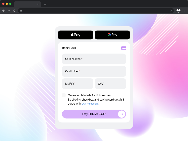
Branded graphics or patterns
If your e-commerce website features graphics or patterns associated with your brand, this can also be a good option for the background image of your payment form.
Remember not to make the graphics or patterns too overwhelming or distracting for users.
4. Colour palette
If you want to create a seamless checkout process experience for your shoppers and do not want to confuse them when they are transferred to the hosted payment page, apply your brand colours to the form, too.
When the colour palette of the payment details page matches your brand's corporate colours, the customer may not even notice they were transferred to the hosted payment page.
You should also change the colour of the buttons, the heading, and the navigation elements to match your website.
5. Logo
Adding your company’s logo to the website payment page is another way of boosting customer trust, as it again reinforces that they are making the payment within the same environment, rather than completing their transaction on another website.
6. Security certificates and payment methods logos
Icons showing the payment is secured and the logos of trusted available payment methods should be located on online payment forms. For customers, this demonstrates the page is secure, and helps to alleviate concerns about whether their details are safe when making a payment.
Customers must trust that their sensitive financial information is secure when completing a transaction. A key technology that helps ensure the security of online transactions is SSL (Secure Sockets Layer).
SSL is a security protocol that encrypts data transferred between a user's browser and your website. It ensures that sensitive information, like payment details and login credentials, is securely transmitted, preventing interception by malicious parties. SSL is indicated by a padlock icon and "https" in the browser’s address bar. This encryption helps maintain data privacy and protects users from cyber threats.
7. Unified design and testing
If using a multi-page checkout, It is important to preview and check each step of the payment process that the customer is going through. Make sure all the designs, colours, and images are stylised in the same way.
If you are not sure that your chosen design works well on your payment page, you should test it in real time to see how the customer is experiencing it. If you want to see how two different versions of the payment page design perform, you can also run an experiment using A/B testing to measure which has the highest conversion rate.
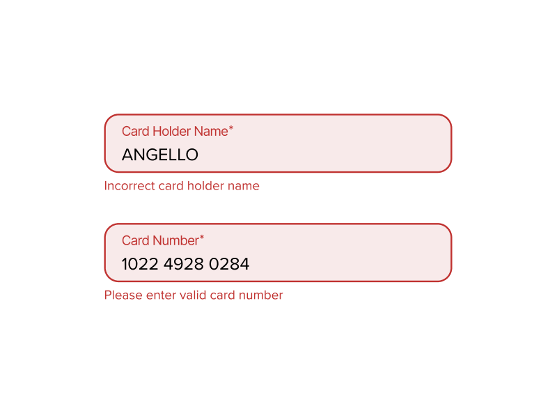
8. Highlight mistakes
Often, customers misspell something or enter the wrong data in one of the fields on the payment details page. To increase the success rate the form should highlight the field where the wrong financial or other information is entered.
It is also bad practice for a customer to have to re-enter all fields again when the payment doesn’t go through - and this can lead to a surge in cart abandonments.
Payment auto-fill, which populates the fields in a single click by connecting to the customer’s payment information stored in their browser or mobile app (or for return purchases on your website), can help prevent incorrect field entries and make the form completion as frictionless as possible.
9. Managing saved cards
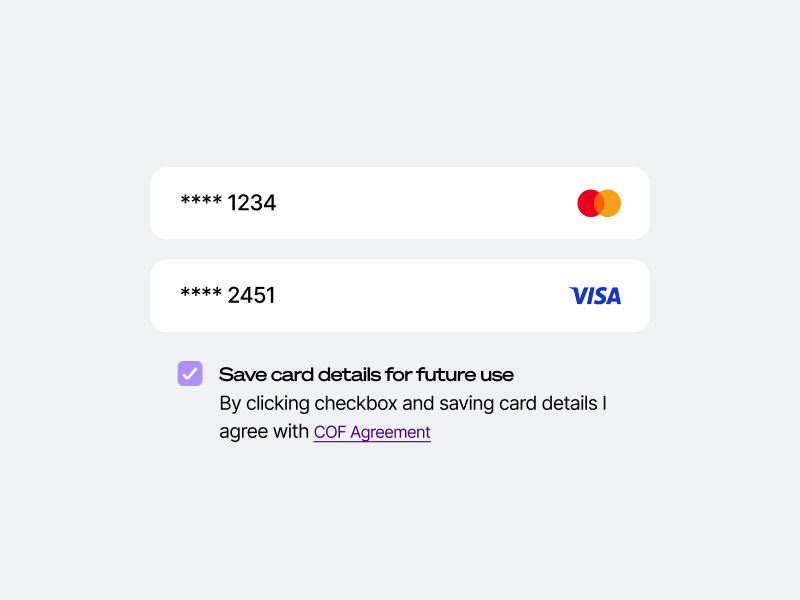
Make it convenient for returning customers to find their saved cards when they land on the payment page.
Also, the payment page UX should make it clear how to add a new card or delete expired cards. To prevent customers from removing the wrong card from the account, implement a two-step removal process to minimise the risk of them doing this by accident.
10. Adopt innovative solutions
A recent report by IMRG revealed that 70% of purchases are completed on smartphones. With so many people shopping on mobile devices, it is important to make sure that the mobile payment page design is as user-friendly as possible.
Allowing customers to confirm the payment with Face ID and Touch ID can help to increase the payment conversion rate. Additionally, an option to offer payment via QR code or payment link is useful when the shopper starts browsing on the desktop version and confirms payment on the mobile device.
11. Implementation options
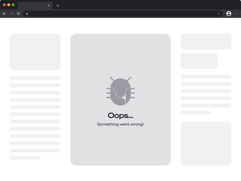
An iFrame (inline frame) is one of the payment page technologies. It works as follows: the customer presses the “purchase” button, and the new webpage with payment details opens on the last webpage that the customer is browsing. The payment details form can have a different web address and can be hosted on a different server.
The problem with iFrame is that it is a pre-designed frame that is inserted into the payment page template. Sometimes, the iFrame does not fit well with the chosen template, and the customer has to scroll down to press the “confirm” button. Many users simply won’t do it or might assume the page is broken and leave, leading to a higher abandonment level.
Fortunately, there is a more sophisticated alternative.
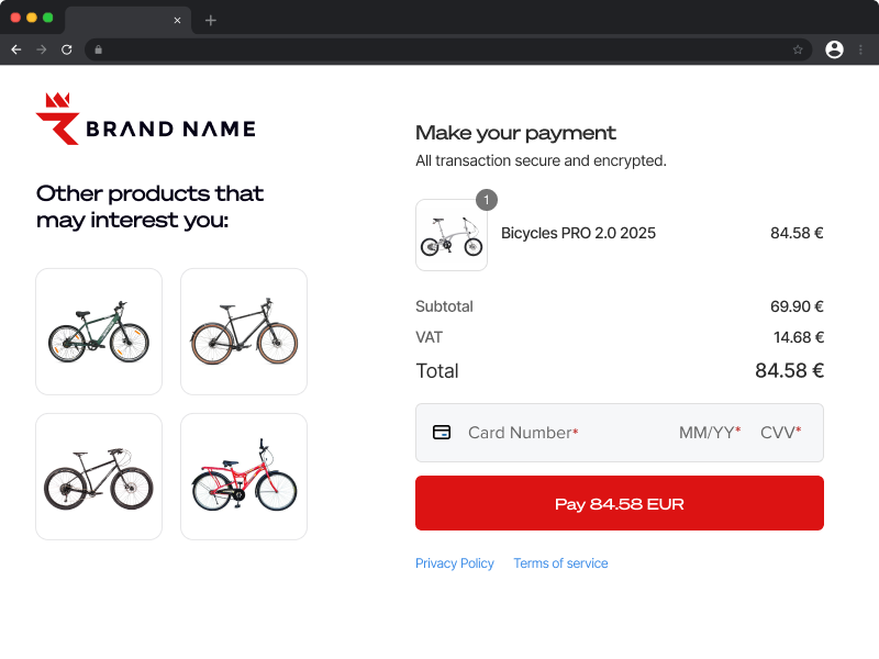
Microframes streamline the payment process with a modular approach that only requires the customer to enter card details. This one-page checkout provides a quick and simple way to pay.
12. Alternative Payment Methods
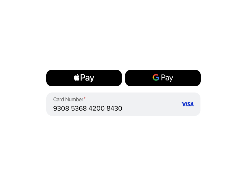
Besides the payment page UX, it is important to think about the variety of payment methods you are offering to your customers. Offering the payment options your customers want significantly increases the probability of them completing the transaction successfully. A recent study of online retailers revealed that approximately 50% of purchases were made using Alternative Payment Methods. This includes digital wallets, Direct Debit, open banking, and BNPL.
It is essential to adopt payment methods that match the demographic breakdown of your customers. For example, you miss out on reaching more than 500 million users worldwide by not offering Apple Pay. Also, the favourite payment options often differ among countries. In the Netherlands, for example, one of the most popular payment methods is iDEAL, and so merchants serving this region would see significant revenue loss if this was not available to their customers.
13. Automatic currency conversion
Many customers shop cross-border. But if they don’t know how much they are spending in their local currency, they may be less likely to make a purchase.
Having automatic currency conversion built into the payment page gives customers the choice of making a purchase in their preferred currency. Providing them with auto currency switching improves transparency and customer satisfaction, leading to increased conversion rates.
How to make a payment page in less than an hour
There are various examples online that explain how to design a payment page.
However, designing a website payment page can be resource-intensive, as many players need to be involved. Employees across departments must get to know all the specifics that are relevant to the payment page design, which is unlikely to be their core competency. Valuable hours need to be spent not only communicating with their in-house team but also with account managers, support, developers and testers of the payment service provider to get things up and running. The communication chain is long and requires attention from all the parties involved.
At Ecommpay, we wanted to make creating a payment page as simple and fast as possible while ensuring they are designed to convert.
Introducing our payment page designer
Ecommpay clients have access to a hosted payment page designer. The tool is intuitive, flexible, and easy to use, making it a perfect solution for merchants who want an online payment page design that will boost trust and payment conversion. Anyone can create a winning payment form in less than an hour.
Our interface will guide you throughout the process, starting with the UX of the payment page and ending with the look of the payment confirmation page.
The best part is that you can build your perfect payment page without the need to approach us, however, our specialists will monitor the conversion rate of your e-commerce website and will advise on how to increase the success rate when needed. We can also help guide you in building your payment page if you need something more complex.
With our payment page designer, you can choose the required settings and designs without the involvement of designers or developers. With real-time updates and the ability to simulate the customer journey without processing actual payments, you can ensure everything works perfectly before going live. If you want to try it for yourself, you can access the demo here.
A custom, well-designed payment page enhances user experience, strengthens brand loyalty, and improves conversion rates. Find out more about our hosted payment page, or connect with a member of our team.
